An appealing website for an online shop could be a significant factor in terms of business success. Today post will analyze the main pages of two E-commerce websites, Alibaba and Square. This analysis will look at the code for each web page and their components and features namely Header, main body of page and Footer.
User Interface (UI)
Websites Header:
Alibaba
SquareWe can notice that Square main page does not have a Search bar or a product category feature whilst Alibaba main page contains both features. The shopping cart button and the logo with link functionality are incorporated in both web pages. Login functionality it is present on both websites however Alibaba has an effect when the cursor is over the login button.
Alibaba
Square:
In our initial screenshots we can notice the menu structure and components of the two websites.
The navigation menu of Square web page it is a standard menu with five tabs allowing customers to navigate between services provided by the website and a tab reserved for different information that might be useful for customers.
In contrast, Alibaba home page has a richer menu with tabs designated namely for: product category, services provided, exhibition room, customer support. Overall Alibaba main page has more utilities and features than Square web page however we can assume that the reason for this could be the fact that the two businesses are not identical. Alibaba offers a wide range of products and services and Square offer mostly services.
Main body of the web pages:
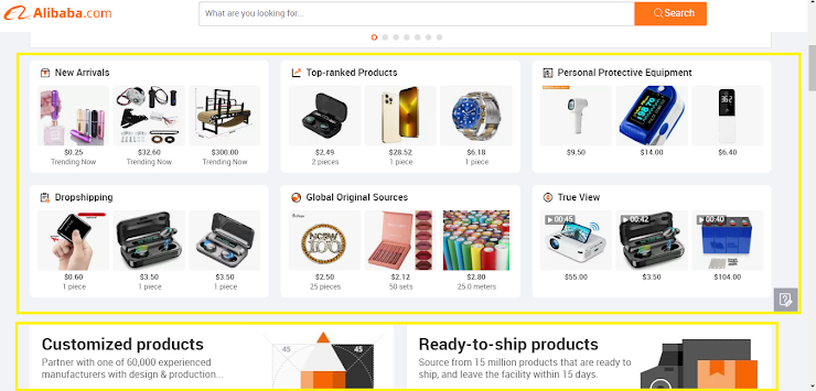
On the main body of Alibaba web page we can notice a banner or a carousel advertising promotions or various services. The banner has a good content quality and the images link when clicked. The banner it is timed and has the side navigation arrow option.
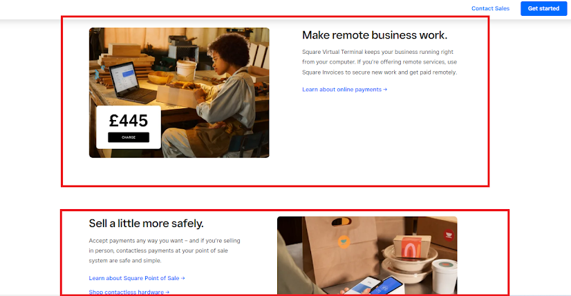
In addition both companies use the main page of the web site as a modality for marketing. The images of the advertised products and services link to the specific product. The Square website has a superior quality of the main page body with a simple appearance. This option allowed developers to create high quality images whilst Alibaba advertisement is focused on product quantity and variety rather than the quality of the advertisement
Square.
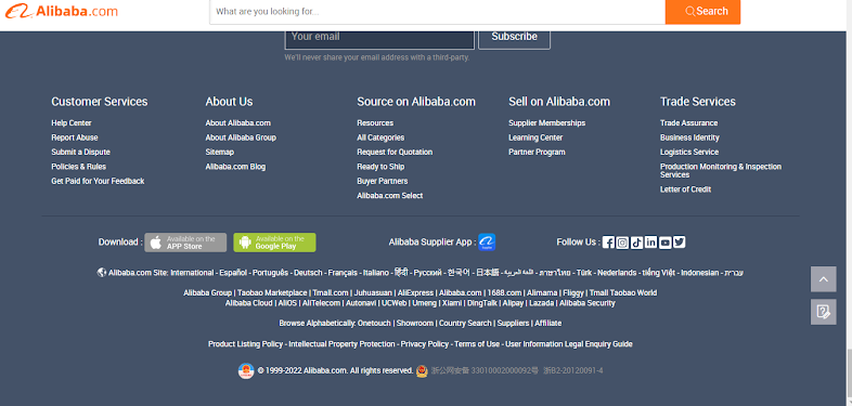
Alibaba: No Website could be complete without a footer. It contains information relevant to customers that can not be provided in another section of the website. It is common for a footer to include information related to copyright, policy, contact details, social media and a email subscription form.
Alibaba website main page footer has incorporated the above features in addition, a list with the services provided by the company represents a tab of the footer menu. A feature that allows users to select a different language. Another section of the footer it is given by a referral list with Alibaba partnership. The name of the partners links to their website if selected.
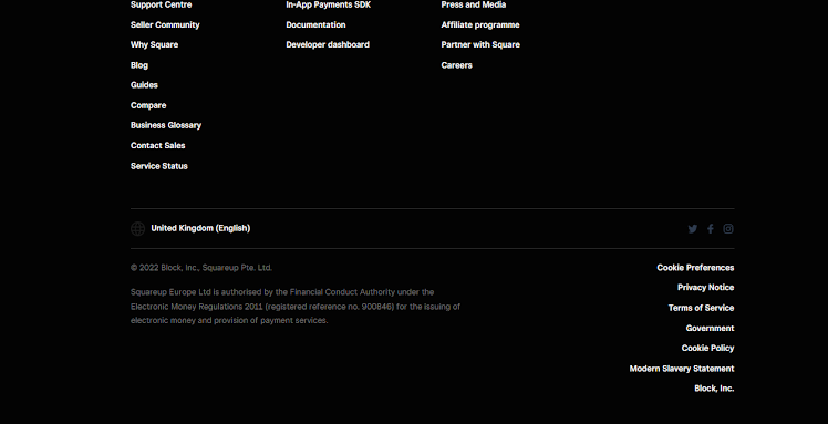
On the main page of Square website we can notice that the footer it is focused on the business and the services provided. These type of information constitute a major proportion of the footer. The standard sections with information are present however, they represent a small proportion of the footer.
The code of the website main page
Many website owners use numerous strategies and techniques to make their website notable. One common strategy is the use of meta-tags with the purpose of promoting the website into search engines. Both our online businesses use meta-tags namely meta title tag, meta description tag, meta keyword tag with the purpose of communicating information about the website to search engines. Alibaba meta keyword tag it is rich in words compared with Square. Another important strategy is the use of open graph meta tags which improve communication with social media platforms. A similar tag with open graph meta tag is Twitter cards which can be spotted in Square website code.
Alibaba:
An interesting aspect that was revealed during this analysis is the size of code lines used by the two companies. The code for the Square website page has a decent size of 845 code line however, the Alibaba web page contains an impressive code made by 5308 code lines.
In conclusion our analysis suggests that Square website achieved a better and simple user interface making it appealing for navigation however, the menu composition can be confusing and the amount of information is limited. In contrast, Alibaba user interface could be improved considerably, especially in terms of imagine content quality. The menu it is user friendly, well structured and presented and the information's provided by the business are abundant.
References
Alibaba, 2022. Find quality Manufacturers, Suppliers, Exporters, Importers, Buyers, Wholesalers, Products and Trade Leads from our award-winning International Trade Site. Import & Export on alibaba.com. [online] Alibaba. Available at: <https://www.alibaba.com/?src=sem_ggl&from=sem_ggl&cmpgn=9922923043&adgrp=97780318782&fditm=&tgt=kwd-784652173659&locintrst=&locphyscl=1006867&mtchtyp=e&ntwrk=g&device=c&dvcmdl=&creative=432272607499&plcmnt=&plcmntcat=&p1=&p2=&aceid=&position=&localKeyword=%27alibaba%27&gclid=Cj0KCQjw8uOWBhDXARIsAOxKJ2Ggdhe8-Aot-L3ystFLoess6QK7RwbozFKPyrwPHPzYjj6tCdEoNq8aAmR8EALw_wcB> [Accessed 21 July 2022].
Sharma, 2020. 8 Game Changing Meta Tags for SEO | Clutch.co. [online] Clutch.co. Available at: <https://clutch.co/seo-firms/resources/meta-tags-that-improve-seo#Open> [Accessed 21 July 2022].
Square, 2022. Accept Payments Anywhere - Grow Your Business | Square. [online] Square. Available at: <https://squareup.com/gb/en?device=c&gclid=Cj0KCQjw8uOWBhDXARIsAOxKJ2Gpw5ba4mvHVCTVns2wP1Ap9_hTYwwZzWcJJ2cdH94hbZY9VnYeLxMaAmeIEALw_wcB&gclsrc=aw.ds&kw=square&kwid=p67911387852&matchtype=e&pcrid=566382266624&pdv=c&pkw=square&pmt=e&pub=GOOGLE> [Accessed 21 July 2022].


good job. I would advice you use the word "we" appropriately. it is your blog and not our blog
ReplyDelete